The Colour-Coding Myth: When a Palette Does Not Explain a Character
Read a film’s recurring colors without reducing a character to a symbol: use scene context, contrast, and palette changes to spot what the image actually suggests.
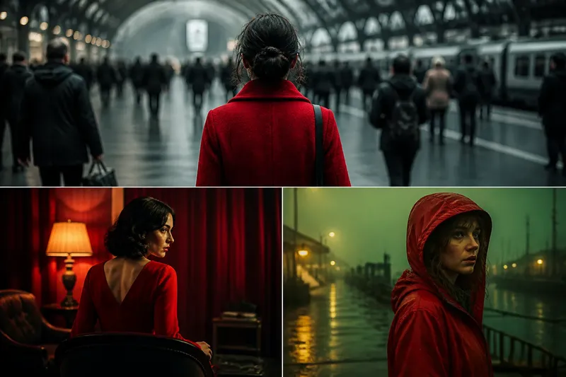
A character wears red in three scenes, and the temptation is immediate: red must mean danger, desire, or anger. But a recurring color in a film does not come with a fixed translation. To read a film color palette well, look at what surrounds the character, how the color changes, and what the scene asks you to notice.
Color can guide attention, create a mood, connect separate images, or unsettle an expectation. Those jobs can overlap, and none automatically tells you what a character “is.” Treat a palette less like a codebook and more like a sentence: a red coat means something different in a crowded gray station than it does in a room full of red curtains.
Why does a recurring color seem to explain everything?
Repetition is persuasive. If a film repeatedly gives one character a particular color, viewers naturally look for a pattern. That instinct is useful, but it can turn into a shortcut: notice blue, decide “sad,” and stop watching the rest of the frame.
The shortcut often comes from familiar associations. Red may suggest heat or urgency; blue may feel cool or distant; green can seem lush, artificial, or sickly. These are possible impressions, not universal definitions. A filmmaker can lean on them, reverse them, or use a color for a plain practical reason, such as making a person visible against a set.
Try separating what you see from what you infer. “Her scarf is the only bright object in the hallway” is an observation. “The scarf proves she is hiding a dangerous side” is an interpretation. Keeping those statements apart lets you test an idea against later scenes instead of treating your first response as a verdict.
What if the color belongs to the setting, not the character?
A recurring hue may say more about a character’s surroundings than about their inner life. Wardrobe, walls, furniture, lighting, and objects share the frame. A character who repeatedly appears in green may be moving through a green-tinted environment, or may simply be the one person whose clothing stands out against it.
Look at the whole image before assigning a personal meaning. Is the color on the character’s skin, clothing, or an object they carry? Does it also appear in the room? Does the camera keep the hue visible, or does it slip out of view when the character moves? These details help distinguish a character motif from a location’s visual identity.
Imagine a detective who wears a yellow raincoat in several scenes. If the coat appears only during wet outdoor searches, the recurring yellow may first identify the weather and activity. If it later appears in a dry, orderly office, that change in setting makes the coat newly conspicuous; the shift may invite attention without proving a single hidden motive.
What if the color feels different from scene to scene?
Color is relational. A blue jacket can look vivid beside warm brown walls and subdued beside a blue window. Lighting also changes its appearance: daylight, fluorescent light, candlelight, and colored illumination can all alter a hue’s character. The film may be changing the relationship, not changing the character.
Compare the color with nearby tones and with the scene’s overall balance. Ask whether the character blends in, stands apart, or seems visually out of place. An everyday analogy helps: a white mug looks bright on a dark countertop and almost disappears on a pale one, even though the mug itself has not changed.
Also notice whether the image is dominated by one hue or built from several. A red dress amid neutral costumes may draw the eye; a red dress amid red furniture may make the character feel absorbed into the room. The same color can attract attention in one composition and reduce distinction in another.
How can context, contrast, and change sharpen a reading?
Use three questions in order. First, what is happening in the scene? A character’s color may register differently during a reunion than during an escape. Second, what does the color contrast with? The surrounding palette shapes whether it feels warm, stark, ordinary, or intrusive. Third, does the color repeat, disappear, or transform as the story progresses?
Keep the answers concrete. Instead of writing “green means envy,” you might note that a green lamp is present when two characters bargain, while the person in green clothing is absent from the later scene. That observation leaves room for several readings and gives you something visible to check when the motif returns.
Change can be especially revealing. If a character’s palette becomes less distinctive after they join a group, the image may suggest assimilation or simply a new visual arrangement. If a familiar hue appears on someone else, it may create a connection, a rivalry, or a deliberate false trail. The film’s next choices help sort those possibilities.
What should you ask when a color reading feels uncertain?
Does the hue recur only around one character?
If it appears across locations and objects, it may be a broader motif rather than a personal signature. Note who or what carries it before tying it to one person.
Does the framing make the color hard to ignore?
A centered costume or isolated object may be emphasized, while the same hue in a busy background may be incidental. Check the image’s composition before treating recurrence as a message.
Does the character’s palette change at a turning point?
A shift can mark a changed relationship, setting, or mood, but timing alone does not settle which one. Compare the scenes before and after the change for other visible differences.
Could a practical choice explain the color?
Costume and set colors can help distinguish people, create continuity, or suit the location. If a practical explanation fits the image, keep it alongside any symbolic interpretation rather than forcing a deeper meaning.
How do you avoid turning a useful pattern into a rule?
Make a small viewing note rather than a color dictionary. Record the scene, the color’s location, its contrast with nearby objects, and the change you noticed. A short note such as “white coat against dark doorway; appears when she leaves” is more useful than “white equals innocence,” because it describes evidence without closing off interpretation.
On a second viewing, check whether your first reading still fits. Look for exceptions: a scene where the character wears a different color, the same hue attached to another person, or a moment when the supposedly symbolic color disappears. Exceptions do not automatically disprove a motif, but they can show that its purpose is more specific than a simple label.
Say you notice that a musician wears black whenever she performs. You might first read the color as secrecy. Then you see black curtains and dark instruments in the venue, while her rehearsal clothes are bright. A more careful reading would be that the performance setting makes her visually continuous with the stage; if the film later keeps her in black away from it, that new context can support a different interpretation.
When you read a film color palette, let a color suggest questions rather than answer them by itself. The most useful interpretation accounts for the scene, the surrounding image, and the pattern’s changes—and remains open to revision when the film gives you new evidence.